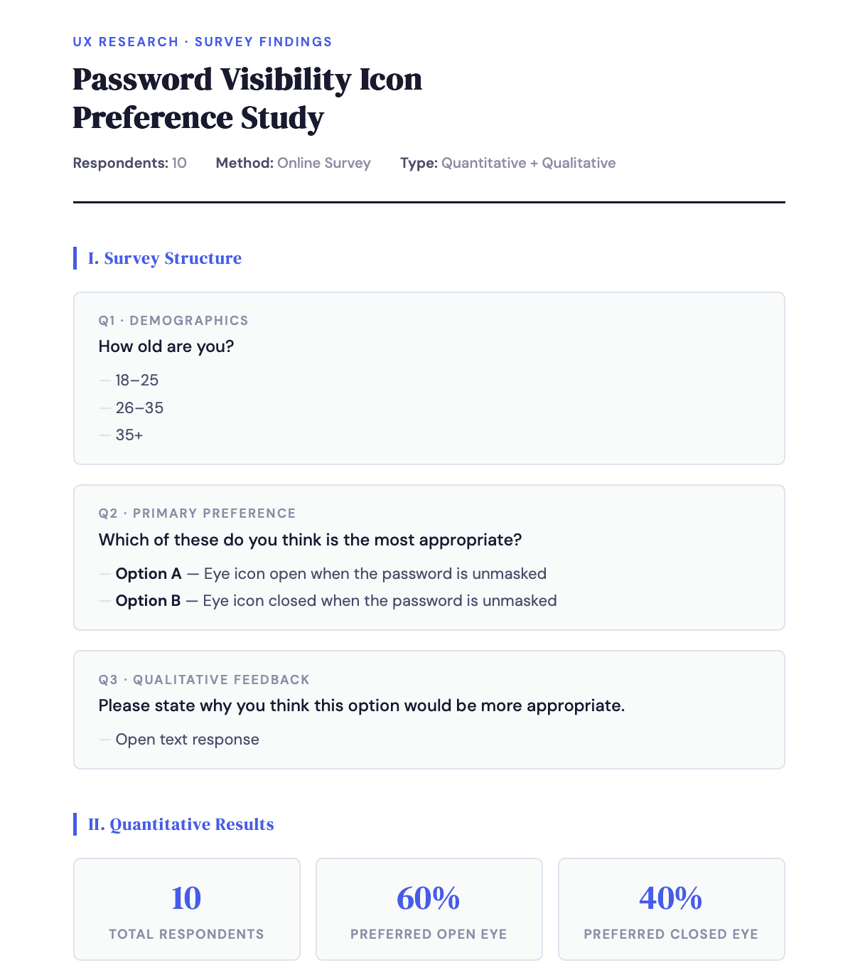
Problem statement
When you first enter a password, it is originally masked so that users can't immediately see what it is, This is useful to prevent someone from looking over your shoulder and seeing what the password says in the case that you are in a public setting. The icon is there so the user can click on it to see the password unmasked to know he/she is typing the password correctly and can also give understanding to the current state of the password.
So the icon is there to improve security and enhance the user experience, but if we can understand if users want the eye icon to be seen as a status or a CTA then it can further improve their experience and prevent confusion on their password field.

Types of usages
In this case we conducted 2 studies, one just participants filling out a survey, while in the other, before the participants had to take part in a survey they had to view an interactive prototype.

The hypothesis based on desk research
The hypothesis was that the eye icon should be closed when masked as we can see through other toggle icons what approach to take. For e.g. the favorite icon or the mute icon. Doing so would also follow the design heuristic of consistency and standard.
We can also see other brands have the same idea as Duolingo and Snapchat are two large apps that decided to use the eye icon and decided that issuing the eye icon as closed when masked would be better practice. Seeing two large apps follow the notion that the eye icon should be closed when masked affirms that this may be the right practice to follow hence why it was our hypothesis that the eye icon should be closed when the password is masked and open when the passwords is unmasked.


User test 1
User test 2
•A participant providing their opinion could very well provide their view without understanding any context behind this. Also typically when a password field is entered, the original state is that the password is masked, not unmasked. Due to this I decided to make an interactive prototype to provide context and to give the user more of an understanding of what this really looks like.
•Testing was done internally on 5 colleagues varying in roles ( BAs, POs and UX/UI designers) and this was done as it can be possible that designers may already have their own preconceived biases on the topic.
Microcopy rationale
Interactive prototype results